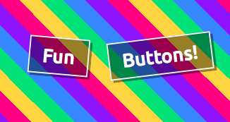
Creating Fun Buttons
 I was doing a bit of web browsing today, when I came across the site https://super.me/ I thought some of the effects were a bit noisy (like the heart thing) however I loved their “fun buttons” that made up the footer navigation. So I decided that I wanted to try recreating them.
One of the new things in CSS3, are transforms. There’s a lot of different values for these, but we’re going to focus on scale and rotate.
The scale(sizeX, sizeY) value allows us to completely resize the element. Both making it really big, or really small. It basically multiplies the font-size, width, height, border, padding, margin, etc by this size. I decided to use this to give the buttons a little pop.
The rotate(value) value allows us to rotate the element. You can pass in values in degrees, and it’ll rotate everything.
Using those two combined with a springy transition allows us to completely replicate this effect.